pageview

Tuesday 20 November 2012


This Person Might Just be The Most Hated Employee at Apple


Want to know who is the most hated employee working over at Apple? You would be surprised to find out. Check out the person’s name below on his business card.
It’s non other then you friendly neighborhood Sam Sung.
Yes, it’s written Sam Sung, the company which has been fighting with Apple since the dawn-of-technology and maybe even before that.
I’m just waiting until Apple uses this opportunity to create a new advertisement which features this guy and he says “I, Sam Sung recommend the iPhone”. But that’s not going to happen anytime soon.
For those wondering, no, this is not photoshopped.

Smartphones: 10 Tips to Increase Battery Life

Computerworld — It's difficult enough to keep plain-vanilla cell phones charged for a busy day of just talking. But these days, we also use our smartphones for e-mail, surfing the Web, editing documents, accessing corporate networks, text messaging, enjoying music and video, playing games, managing our personal information and much more -- making it all the more catastrophic when our devices run out of juice.
The problem is that while smartphone capabilities have increased dramatically in recent years, batteries have not kept pace. "Phones do so much more now, but battery technology hasn't advanced that much," says Scott Riddle, digital sales supervisor at BearCom, a retailer of mobile equipment. Riddle regularly hears from customers about their struggles to keep smartphones charged. "Everybody has this problem," he says.
Fortunately, there are many things you can do to significantly increase the time between charges, although no one solution is a silver bullet. "It's a lot of little things that help," according to Riddle.
We asked Riddle and other experts for their best tricks to extend your smartphone's battery life. Here's what they told us.

Remember the basics

First, some basics. You may already know these tips, but if you apply them diligently, they can help increase battery life.
1. Find -- and use -- your phone's energy-saving settings. A little time exploring your smartphone's interface will reveal where to go to change settings to preserve battery life. Remember that these settings cover multiple aspects of your phone use, so they likely will be in different parts of the interface. But on many phones, such as Windows Mobile and BlackBerry devices, a logical first place to look is in the Settings menu.
Be sure to turn down the default screen brightness, since brighter displays use more power. Also shorten the interval before the display's backlight automatically goes off. The occasional annoyance of the screen going blank before you're done using your smartphone is worth the benefit of longer battery life.
2. Find online tips for your specific phone. For instance, Apple has a page dedicated to preserving battery life on its new iPhone 3G. In addition, there are nonvendor sites with useful battery tips. Here's one for BlackBerry and one for Windows Mobile.
3. Plug in your smartphone whenever you can. Since it's perfectly OK, even desirable, to "top off" today's lithium ion batteries, look for outlets in meeting rooms, airport terminals or wherever you are and plug in. It's also smart to charge up while you're driving. Car chargers for your specific phone are available directly from your phone vendor or cellular operator, and universal chargers are available from vendors such as APC.
4. Talk, don't e-mail. Cellular data connections use between two and four times as much battery power as voice connections, according to Isidor Buchmann, CEO of Cadex Electronics, a vendor of battery testing equipment. For simple communications, call and leave a message instead of e-mailing, he advises.

Manage your software

Many of us are loyal to a specific mobile operating system. And applications make your smartphone useful and fun. But both the operating system and the applications drain the battery, so manage them so they sip, not gulp, power.
5. Update your operating system. "The biggest battery drain is the operating system," notes Kristi Lundgren, Motorola's product manager for the company's Q smartphone. She said that vendors tend to improve power consumption from version to version, so update when you can.
6. Use simple ringtones. "Musical ringtones use the phone's processor, which uses more battery," says Derek Meister, who has the title of double agent with Best Buy's Geek Squad. Simpler, standard ringtones don't require such processing power.

7. Push less. Perhaps the most popular smartphone application is push e-mail, which requires your device to check for messages nearly constantly. That guzzles juice, but settings are available on the server side (you'll need to talk with IT) and, often, on the phone itself that enable your phone to check for messages, say, only every 10 minutes or half hour. Admittedly, this will require an adjustment for those who are used to constant communications, but it's worth it in terms of battery savings.
Besides push e-mail, many other applications and Web services such as instant messaging, navigation tools and stock, news, sports and weather checkers periodically update information. "You may not realize that ESPN, if it's set to update every five minutes, will drain your battery," says Motorola's Lundgren. Close these apps and sites when you're not using them.
8. Ease off alerts. Do you really need your phone to vibrate when any old message comes in? Turn off visual or audible alerts for newly arrived messages or, at the very least, be selective so you are notified of messages from only your boss or spouse, for instance.

Manage your hardware

In the old days, cell phones had only one radio for making voice calls. Besides a radio to handle regular cellular voice and data services, today's smartphones can also have Bluetooth, Wi-Fi and sometimes GPS radios.
9. Turn off unused radios. Switched-on radios use power even if they're not being used. Learn where on your smartphone to turn off each specific radio. On most Windows Mobile devices, for instance, if you press and hold down the Home button, a dialog box appears in which you can easily turn radios on or off.
10. Watch the time. Cellular radios work harder when a lot of people are accessing the network. "Calling at three in the morning uses less battery than calling at supper time," says Cadex Electronics CEO Buchmann. Granted, calling at 3:00 in the morning probably isn't convenient for you or the person you're calling, but if you're an early bird on the West Coast, 7 a.m. might be the perfect time to call a contact on the East Coast.

Android vs iOS; A Usability Battle

Lately I’ve noticed a number of articles with gripes and groans about the Android user experience, the way interfaces are designed, the usability of Android apps, and a lack of satisfaction with the whole Android ecosystem.
As someone who works on day-to-day basis with usability testing and user experience design, my interest was piqued. Were these users just iPhone users who expressed dissatisfaction after a brief flirtation with Android, or was there something deeper going on?
I can’t honestly say I’ve had a lot of experience with Android – although I do own two iOS devices – so I couldn’t write off these concerns one way or another. But rather than basing it off a few, possibly biased opinions, it seemed the fairest way to compare the two was to set up a quick usability test.

A/B Testing and Preference Testing

This particular tests uses two different questions types; an A/B test, and a Preference test.
An A/B test is where you are presented with either image A or B (not both) to see how you interact with it in isolation. When looking at the results you get a fair comparison between A and B, and thus have a fair idea of how the two different designs or interfaces compare. It’s easy to judge which interface is the winner if it takes users a lot longer to interact with one than the other, or if they frequently select the wrong location or button for a simple task.
A Preference test has the two designs or interfaces side by side. This is a bit more of a popularity contest, but in the interests of fairness I’ve obscured the ‘status bar’ (the bar at the top) of both the iOS and Android apps in the preference test in order to try to eliminate people’s personal, preconceived preferences. When looking at the results, we can hopefully detect a trend about which interfaces or designs people prefer.
I know there are many people out there firmly on one side or other of this debate, but hopefully this test might help you to reconsider your preconceived notions.

The Test and Results

For each of the apps in the test, I tried to think of a very simple, common task that people might be trying to perform. If it works out that people take roughly the same amount of time to complete each task, or it works out that there is a huge difference between the two platforms or even from app to app, then we can start to form some judgements about what is going right or wrong, and which platform is more or less usable
If you are interested you can take the test yourself to add to our results.
On to the questions and results:
1) The Twitter App: How would you view your @ messages?
If you are a Twitter user, and even if you’re not, you are probably familiar with the @ message protocol. For those who aren’t, @ messages are the method you use for contacting other users on twitter. For example, if you wanted to contact me, you could send a message to @IntuitionHQ.
As a very simple, very common task, this should really take no time to complete. As it’s the first question in the test, we might expect people to take a few seconds longer as they are familiarising themselves with the interface.
Twitter iOS heatmap result from IntuitionHQ.comTwitter Android heatmap result from IntuitionHQ.com
The results for both for the Android and iOS versions were very similar; the most surprising thing here was the amount of people who clicked the direct message button instead of the @ message button. I guess Twitter still isn’t quite as popular as I may think.
Android 1 – iOS 1

2) Google Translate: How would you change the target language from German to another language?
Changing languages is obviously a core piece of functionality for a translation app, and should be quick and easy to do. Lets see what the results show:
Google Translate - Android - HeatmapGoogle Translate - iOS - Heatmap
Again, quite similar results. The Android version had a shorter response time at the time of writing by 2 seconds (possibly because of the addition of the arrows on the dropdown?) but also had slightly bigger spread of results. More or less a tie for these two.
Android 2 – iOS 2

3) Google Translate: How would you listen to the German audio pronunciation?
This is one of the really handy features of the Google Translate app – you can make it talk to you in a ton of different languages. Extremely useful when you are travelling or trying to learn a new language, and a common task within the app.
List to audio - iOSListen to Audio - Android
This is the first time (at the time of writing) that there is a bit more of a spread in the results. The Android app had a longer click time (average of 12 seconds), but an 80% success rate, whereas the iOS app had an average click time of 6.42 seconds but only a 52% success rate.
Regardless of click time, a 52% success rate isn’t nearly high enough, and so the Android version wins this battle. The Android app Speaker icon must be clearer to most users.
Android 3 – iOS 2

4) Soundhound: How would you share this song?
Soundhound is a handy app for finding the name of songs you are listening to but (obviously) don’t know the name of. The social aspect is obviously a big part of making a successful app in this day and age, so it’s essential that users can find and understand these task very quickly.
Soundhound app - Android vs iOS sharing comparison
Interesting results; although the click success percentage is more or less the same (93% to 95%), the average click time is really very different. The iOS version took around 13 seconds longer in our test than the Android version. A win for Android.
Android 4 – iOS 2

5) Soundhound: How could you purchase this track?
Buying the songs that you’ve gone to the effort of finding is another handy feature of this app. How does the music purchasing stack up?
Soundhound - iOS vs Android 'buy' comparison
Android is slightly ahead here, with an average click time of 5.83 seconds to the iOS versions 7.64, and a success rate of 100% to iOS’ 90%. Still a win for Android, but I’ll give half a point to iOS for still a very strong results.
Android 5 – iOS 2.5

6) Pandora: Which interface do you prefer?
This is a preference test to see how users feel about the different designs of the Android and iOS apps. I’ve removed the status bar at the top of the apps in order to make people think a little more about which is the Android or iOS version of each app.
Pandora - Android vs iOS preference test
And now the results for the first of our preference tests; it couldn’t be any closer with both the Android and iOS versions of the app getting 17 clicks each. A draw.
Android 6 – iOS 3.5

7) Pandora: How would you pause this track?
A very common task in any music listening application; I’d expect a very strong response on this question.
Pandora iOS - PausePandora - Android - pause
The results here (perhaps unexpectedly) are both very strong. Both apps had a 100% success rate, and with just over half a second between the average click times (3.64-2.86 seconds) I’m going to give both apps a point for this test.
Android 7 – iOS 4.5

8) Geocaching: Which interface do you prefer?
Another comparison between an Android and iOS interface, this time for the official Geocaching app. Geocaching – for those who don’t know, is a process where you navigate to certain GPS coordinates in order to find a hidden ‘cache’.
The designs of the two are further apart than some of the designs we’ve seen, so it will be interesting to see what the results show up.
Geocaching app preference test
Another overwhelming result, but this time to the iOS versions – 91% of respondents preferred the iOS version of this app.
Android 7 – iOS 5.5

9) Geocaching: Please select the cache you’ve previously found:
Once you’ve found a certain cache, you tag it in the app and it then shows up as previously discovered. This is a quick test to see if that is easily noticeable in the Android and iOS apps.
Geocaching found comparison
An interesting result here. The click time for both apps was very similar, but the success rate for the iOS version was only 40% compared 100% for the Android version. Quite surprising to me that there was such a big difference between these two, but there we are. A win for Android.
Android 8 – iOS 5.5

10) Facebook: Which interface do you prefer?
Another preference test with an app that most people would be familiar with. Facebook has made a couple of changes between these two apps, and it will be interesting to see what the results show about the differences
Facebook Preference test
Definitely the majority support the iOS version of the Facebook app here. I wonder how much of this is because they are already familiar with the design? The final results was 74% for iOS and 26% for Android. A win for iOS.
Android 8 – iOS 6.5

11) Facebook: How would you view your friend requests
Facebook is all about friends, so accepting requests is core functionality for this app. It may only make a few seconds difference, but every part of the user experience counts.
Facebook Requests Comparison
An extremely close result here, and in fact any of the selected areas allow you to view your friend requests. Considering the results are within a quarter of a second, I’m going to call this one a tie.
Android 9 – iOS 7.5

What does it all mean?

So the final result (as of writing) is Android 9 and iOS 7.5; you can also view the most recent usability test results yourself to form your own conclusions.
What we can conclude though, is that Android and iOS are very similar in terms of usability, at least in the apps we have tested. Of course, there are apps on both platforms that are really very well designed, and apps which should never have been let into the store/market. Neither platform is immune to poorly designed apps.
One difference that also needs to be considered as part of the user experience is the hardware, and this is where some issues come to the fore. Although you can buy very high quality Android phones, you can also buy very cheap, very poorly designed phones which can cause a terrible UX. One thing you have to admit about Apple is that their hardware is of a very high (and well designed) quality.
Regardless, this test shows that with the right hardware and software combination, both of these mobile operating systems can shine, and really which you choose can come down to personal preference, without worrying about a huge gap between the two platforms. Either way, you should be a happy camper.
What do you think about the results of this test? Why not create your own test to see what you find? Be sure to let us know your thoughts in the comment section below, and let us know if there is anything else you’d like to see us test. Thanks!

20 Awesome Google Maps Tips and Tricks

20 Awesome Google Maps Tips and Tricks

Even if you are regularly using Google maps, probably few of the tips mentioned below might be new to you.

1. Set Home and Work Location

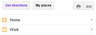
Click on “My places” (located on the top left-side) and set your “Home” and “Work” address. This way, later when you are getting a direction from your home or work, instead of typing the full address, you can just type “home” (or) “work”.

2. Save Directions to My Maps

If you have created a custom map, or a direction with multiple stops, or any other customization, you might want to save it for later use. Once you get the directions, click on the “Save to My Maps’, which is located at the bottom where it displays the text directions.

Once you’ve saved a map, you can view them later by going to “My places” -> “Maps”.
You can also create custom maps with your own notes, markers, etc. The video on this creating custom maps page explains how to use this feature.
3. Collaborate Saved Maps
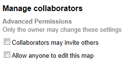
You can mark your map as public or private. You can also invite your friends to collaborate and edit your custom map. This is helpful when you are planning a trip with your friends and want to collaboratively plan the direction with some stops in between.

Once you’ve saved a map, go to “My places” -> “Maps” -> Select your map -> Click on “Collaborate” link on the top to manage the collaboration settings.

4. Favorite Locations

While viewing a particular location (restaurant, park, etc), you can click on the ‘star’ icon as shown below to mark it as your favorite location. Once you mark it, you can view all your favorite locations by going to “My places” -> “Starred”.

5. Switch to Street View

You can switch to a street view from few places. When you are viewing a particular location from the map (i.e from the little location info pop-up) -> click on “more” -> and select “Street view”.
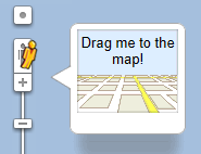
You can also click on the “Man” icon that is located on top of the “zoom” scale, and drag this man and drop it anywhere in the map to view the “street view” of that location.

After you get your directions, from the left-side text directions, you can move your mouse on a specific line item, which will display the “Man” next to it as shown below. Clicking on this man, will split the right-side map into two half. The top portion will display the street view of that particular direction, and the bottom portion will show the 2d map.

6. Customize the Print View

Once you get your directions, click on ‘Print’ icon. From this page you can perform the following customization.
You can add notes on the textarea given at the top. This is a good place to note down telephone numbers of the person you are going to meet at the destination, or reservation confirmation number, etc. This way when you print the direction, you have your custom notes along with it.
By default the print view will display the “Text only” directions. However, when you move your mouse on a particular line item in the direction (in the print view), it will show the option to display “Map” or “Street View” only for that line item. This is helpful when you want to print the “Street view” only for your destination location (and not for every turn).

7. Get Link for your Direction

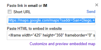
Once you get your directions, if you want to quickly email it to your friends, you can get the link for the direction by clicking on the “Link” icon that is located next to the “Print” icon on the top left side.

8. View Traffic

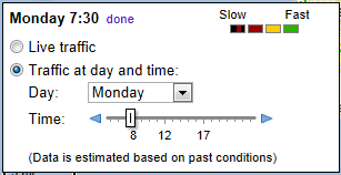
To view the traffic, on the top right-side, move your mouse to “Satellite”, which will display a drop-down list, select “Traffic” from this list. This will display the live traffic by default. If you are planning for a trip in the future date, you can approximately predit the traffic at that time by choosing your day and time of travel as shown below. This uses the traffic data from the previous day and time based on your selection.

9. Google Earth View

You can also view the “Earth View” by installing the google earth browser plugin. This will give the option to view the maps in 3D from the browser itself. Currently this plugin is available only on Windows and Mac OS. Move your mouse to the “Satellite” at the top right-side, this will also display “Earth” icon next to “Satellite”, click on this to install the Google Earth plugin.

10. Add Multiple Destinations

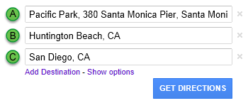
When you are planning for a trip, you can also add multiple destinations along your trip and get one route for all of these. Click on the ‘add destination’ link right below the “A” and “B” location as shown below. You can add as many destinations as you want.

11. Locations with an Icon

Any location on the map that has an icon is clickable. When you click on it, you’ll get more information on that particular location. Typically you’ll see location with an icon for parks, colleges, airports, etc.

12. Freeway Exit Numbers

At a closer zoom level, you’ll also see exit number on the freeway in the 2d map.

13. Search Nearby

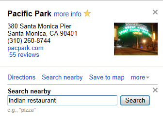
When you are viewing information about a particular location (from the little info pop-up), you can also click on ‘Search nearby’ and search for any nearby point of interest (for example, gas station, starbucks, etc.)

14. Google Map Maker

Using Google Map Maker, you can update information about your local area to the google maps. Once the update you make are reviewed and approved, it will be visible for everybody to see.

15. Moving Pane

Click on the little arrow shown at the bottom right corner, which will display a zoom pane. From here it is easy to move around the map in the current zoom level.

16. Google Maps Lab

Click on the “Maps Lab” link located on the bottom left-side. Please keep in mind all the features available in the Maps Lab are beta only.
You can enable Google maps add-ons like Distance Measurement Tool, LatLng Tooltip, etc, from here.

17. Bicycle Route

You can also get bicycle route from google maps. Click on the bicycle icon on the top left-side and get the bicycle route direction. When google maps is showing the direction in bicycle mode, the map will also show the all possible bicycle routes available around that area in the map.

18. Public Transit Route

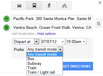
You can also map your route if you are using public transportation. Click on the public transit icon on the top, this will display the following additional option, where you can specify the date and time of your departure. You can also select the mode of your public transit (i.e bus, subway, etc.).

19. MapsGL

MapsGL is currently in beta state. This uses the WebGL technology (web-based graphics library). This will bring some 3D features to the google maps without having to install any additional plugins.

20. Street View Gallery

Google street view is not just for streets. Google maps team have used the same street view technology to capture some non-street views like Amazon river. Check-out the entire Street View collections.

Facebook Testing Automatic Photo Sync for iOS

Facebook Testing Automatic Photo Sync for iOS

Having rolled out an auto-upload function for some Android users in September, Facebook is now testing the same photo syncing system for iOS users too.
The tool is only in testing—so as a result it's only available to a limited pool of users at the moment—but the basic premise is simple. Much like Google's instant photo-upload feature, Facebook can suck every picture you take up and off to the cloud, where it ensures your pictures remain private, placing them in a "Synced from Phone" tab inside your Photos page.
To check if you have the option open to you, head to the Photos sectiom in your iOS Facebook app's sidebar navigation. Scroll to the bottom: if you find a Photo Sync option, check it, and the system starts running straight away.
No doubt some users will worry about privacy, but if you're happy using the service through Google, this is hardly any different. Plus, your photos land up on Facebook, which is more useful than them arriving on Google+.
It's currently not clear if the photo syncing tool will be rolled out to all users, but the fact it's being tested in Android and iOS suggests it's likely. [Facebook via TechCrunch]

Top 10 Photo Fixing and Image Editing Tricks

Top 10 Photo Fixing and Image Editing Tricks

You probably know what Photoshop disasters look like, but your photos can benefit from more subtle and elegant touch-ups. With these tools and techniques, you can sharpen, texturize, re-contextualize, and remove tourists, among other problems, from your shots worth saving.
Posted by Prasanna Yadav

10. Create Your Own Bokeh

Top 10 Photo Fixing and Image Editing TricksBokeh is a cute name for something you've noticed before, but probably never really pinned down—the gauzy, creamy light points that appear behind the subject that's in drastic focus in a picture. Photo site DIY Photography explains how to harness and control bokeh effects, using a photo lens like a 50mm F/1.8 and creating a small lens cover with just the right kind of hole cut out. Lacking for the right kind of digital lens? The Photojojo blog details an analog-to-digital lens adaptation, perfect for garage sale and eBay finds. (Original posts: Bokeh, DSLR lenses)

9. Make Pop Art from Your Photos

Top 10 Photo Fixing and Image Editing TricksSome shots have great subjects, angles, or scenes, but just can't be saved from bad lighting or other mistakes. When that's the case, your saving grace can be Photoshop guru Melissa Clifton's pop-art-style fixes. She's shown us how to Andy-Warhol-Up photos, as well as make zoomed-in-comic-style, Roy-Lichtenstein-inspired pop art from photos both good and bad. If you're not a Photoshop lover, or even owner, you can arrive at a similar bad-shot-as-art result by using Rollip to Polaroid-ize your photo, or use the Poladroid desktop software. (Original posts: Warhol, Lichtenstein, Rollip, Poladroid)

8. Convert to Black and White the Right Way

Top 10 Photo Fixing and Image Editing TricksIt's easy to turn a color image into black and white on a computer, and sometimes that's enough to rescue high-grain, fuzzy shots, like concert photos. Before you hit the switch, though, take Helen Bradley's advice on black-and-white conversion, which can make your shot actually suit the specific strengths of grayscale coloring. Got a specific subject to highlight? Try adding a dash of color to give your shot unique appeal. (Original posts: concerts, conversions, color in b&w)

7. De-Pixelize Graphics and Small Photos

Top 10 Photo Fixing and Image Editing TricksResizing images is grunt work enough—having to deal with pixelated results is just torture. Free webapp VectorMagic can make your graphic-style images into vector art that scales clean and smooth as it's sized up and down. It works better with clean line drawings and small, icon-like photos than full-size shots, but if you can tolerate some loss of detail, it's a lifesaver. (Original post)

6. Make Photos Look Like Miniatures with Tilt-Shift Tools

Top 10 Photo Fixing and Image Editing TricksWith tilt-shift photography, you can put being 50 rows back from the action to your advantage. A professional lens can run upwards of $1,200 for a very single-use tool, so try some DIY solutions. MAKE shows us a DIY lens that looks like it's made from, of all things, a plunger. There are also two web-based software tilt-shift solutions: TiltshiftMaker and TiltShift—we prefer the latter for its options and control, but the mostly automated TiltshiftMaker also gets the job done in simple fashion. (Original posts: DIY lens, TiltShiftMaker, TiltShift)

5. Use Textures to Liven Up Flat Images

Top 10 Photo Fixing and Image Editing TricksFor whatever reason, perfectly fine photos can lack definition. Sometimes it's tricks of light and lens, and sometimes it's because Cousin Jeff wore a sweater that just turns out like a blob. Try adding textures to a photo with layering techniques. A scanned sheet of white paper, for example, saved an otherwise washed-out photo in Digital Photography School's example. It's not a save-all, and definitely has potential for abuse, but it's a nice saving grace to have in your mental back pocket. (Original post)

4. Create Stunning and Realistic HDR Photos

Top 10 Photo Fixing and Image Editing TricksHigh dynamic range photos are a world unto themselves, and difficult to pin down in a few sentences. A noble attempt: they make your brights brighter and darks darker, and give a more realistic look to photos. We've previously pointed to a few good guides to shooting and editing in HDR fashion: the Backing Winds' beginner's Photoshop tutorial, Gizmodo's guide to realistic HDR, and a Flickr set by Leviathor that shows how unrealistic HDR can look, if you're not careful with how you combine images. (Original posts: Photoshop, Gizmodo guide, surreal vs. real sets)

3. Sharpen Images the Smart Way

Top 10 Photo Fixing and Image Editing TricksAs we learned the hard way, giving your images a crisper look requires more than just leaning on the "Unsharp Mask" crutch every time. It does have its uses, though, especially if done the right way. But there's also a more fine-tuned way to sharpen your images, as Cameron Moll explains in a blog post. (Original posts: Unsharp mask, Smart Sharpen)

2. Remove People from Otherwise Perfect Shots

Top 10 Photo Fixing and Image Editing TricksStupid vacationers! Always standing and gawking at the same thing you're trying to capture just perfectly! There are ways around the herd's tendency to wander into your shots. For one, take a whole bunch of images from the same position, with the same settings, and use Photoshop's statistics and stacks tools to remove the people, almost entirely, from your shot. Online tool Tourist Remover does a similar task after you upload multiple photos. No luck with automated filtering? Try removing the background entirely and grabbing what you can from your perfect shot. (Original posts: people-free, Tourist Remover, backgrounds

1. Craft Panoramas from Regular Shots

Top 10 Photo Fixing and Image Editing TricksThere's nothing wrong with your run-of-the-mill digicam, but when you want to capture the sweep and scope of a big scene, its small lens can't quite tackle the job. Don't give up, though—switch to manual settings, take a series of shots, and stitch together a panorama with free software. Our own guide relies on the very adaptable and customizable Hugin software, but we've previously pointed at a few good packages for different levels of automation and customization: AutoStitch for the click-and-go method, You Suck at Photoshop's PhotoMerge tutorial for the PS-loving set, and Microsoft's powerful Image Composite Editor for another alternative. (Original posts: AutoStitch, Photomerge, Composite Editor)

Windows 8 Dissapoints

Click here to find out more!

Windows 8 interface called 'disappointing' by usability expert

An expert on user interface design has called Windows 8 “disappointing” for novices and power users alike.
Jakob Nielsen, principal of the Nielsen Norman Group, studied how a dozen experienced PC users interacted with Windows 8, and the conclusion was not good.
“Windows 8 on mobile devices and tablets is akin to Dr. Jekyll: a tortured soul hoping for redemption,” Nielsen wrote. “On a regular PC, Windows 8 is Mr. Hyde: a monster that terrorizes poor office workers and strangles their productivity.”
Although the sample sizes of Nielsen's studies are small, he argues that they provide more insight than larger studies focused on metrics. Even if you don't agree with that assertion, Nielsen does make some good points about how the design of Windows 8 needs improvement.

Windows 8's dual nature

Nielsen's main gripe, unsurprisingly, is the dual nature of Windows 8, which combines desktop and touch-friendly environments into a single operating system. Not only is the user interface inconsistent, it also requires users to remember where to go for which features, and to waste time switching between interfaces. Also, when users are running a Web browser in both interfaces, they can only access a subset of their open Web pages at any given time.
But even the Modern-style interface on its own has some major problems in Nielsen's view. He felt that the inability to open multiple windows of a given application creates a “memory overload” for complex tasks, because users have no way to see all the information they've collected. The charms panel, he said, hides generic commands such as search and individual app settings, so they're “out of sight, out of mind,” especially for novices.
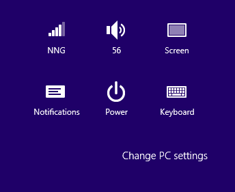
The Windows 8 settings menu, which slides out from the right side of the screen.
Windows 8 settings menu
Nielsen also pointed out a quirk in the Windows 8 settings menu: While most of the options are presented as flat, monochrome icons, the option to change PC settings is shown in plain text, so it “looks more like the label for the icon group than a clickable command.”
As a layman, I don't agree with all of Nielsen's assertions. He knocks some Modern-style apps for having “low-information density”—for instance, the Los Angeles Times app, which shows little more than a large image and a headline on its opening screen—but I actually find those sparser layouts to be refreshing. Nielsen points to the Times' website as a better use of space but, in my opinion, it's too cluttered and does nothing to draw the reader in.

Windows 8 frustrations

Still, the study does point out some frustration points that I've noticed on my own. For instance, Nielsen claims that some Live Tiles in Windows 8 are too active for their own good, so it's hard to tell at a glance which apps you're actually looking at. Indeed, it can be frustrating to hunt down a particular app when confronted with a series of thumbnail images, none of which displays the name of their respective apps.
A selection of Live Tiles in Windows 8.
A selection of Live Tiles in Windows 8
At the end of the report, Nielsen notes that he's not a Microsoft hater—he praises the sometimes-maligned Ribbon of Microsoft's desktop apps—and hopes for a better Windows 9, noting that the company has a history of correcting its mistakes. Also, keep in mind that nitpicking user interface issues is Nielsen's job. He's previously done the same for Apple's iPad and Amazon's Kindle Fire.
Disagree if you like, but I think it's interesting to read a close analysis of the Windows 8 user interface. It's a big change for Windows, and it's obviously going to need some tweaking. Hopefully Microsoft takes some of Nielsen's suggestions to heart.
For more on the Windows 8 interface, check out our report on what several UI experts think.

What Comes After the Touch Screen?

Gesture control, devices that recognize different people, and tricks to make a screen feel as if it has physical buttons could be coming to your gadgets.
  • Thursday, October 11, 2012
  • By Will Knight

Finger moves: A Microsoft research project, called Digits, makes gestural commands mobile.
Credit: Microsoft Research
In a few short years, the technologies found in today's mobile devices—touch screens, gyroscopes, and voice-control software, to name a few—have radically transformed how we access computers. To glimpse what new ideas might have a similar impact in the next few years, you need only to have walked into the Marriott Hotel in Cambridge, Massachusetts, this week. There, researchers from around the world demonstrated new ideas for computer interaction at the ACM Symposium on User Interface Software and Technology. Many were focused on taking mobile devices in directions that today feel strange and new but could before long be as normal as swiping the screen of an iPhone or Android device.
"We see new hardware, like devices activated by tongue movement or muscle-flexing, or prototypes that build on technology we already have in our hands, like Kinect, Wii, or the sensors built into existing phones," said Rob Miller, a professor at MIT's Computer Science and Artificial Intelligence Lab (CSAIL) and the chair of the conference.
One of the most eye-catching, and potentially promising, ideas that was on show makes it possible to perform complex tasks with a flick of the wrist or a snap of the fingers.
The interface, called Digits, created by David Kim, a U.K. researcher at both Microsoft Research and Newcastle University, is worn around the wrist and consists of a motion sensor and an infrared light source and camera. Like a portable version of Microsoft's motion-sensing device for the Xbox Kinect, Digits can follow arm and finger movements with enough accuracy to replicate them on screen or allow control of a complex computer game. "We envision a smaller device that could be worn like a watch that allows users to communicate with their surroundings and personal computing devices with simple hand gestures," said Kim (watch a video of Digits in action).
Projects like Kim's could be a glimpse into the future of mobile computing. After all, prior to the iPhone's launch, multi-touch interfaces were found only at this kind of event. Researchers believe that mobile computers are still being held back by the limitations of existing control methods, without which they could become even more powerful.
"We have an increasing desire and need to access and work with our computing devices anywhere and everywhere we are," Kim said. "Productive input and interaction on mobile devices is, however, still challenging due to the trade-offs we have to make regarding a device's form factor and input capacity."
The advance of mobile technology has also given researchers easy ways to experiment. Several groups at the conference showed off modifications of existing mobile interfaces designed to give them new capabilities.
Hong Tan, a professor at Purdue University currently working at Microsoft Research Asia, demonstrated a way to add the feel of buttons and other physical controls to a touch screen: vibrating piezoelectric actuators installed on the side of a normal screen generate friction at the point of contact with a finger. The design, dubbed SlickFeel, can make an ordinary sheet of glass feel as if it has physical buttons or even a physical slider with varying levels of resistance. Such haptic feedback could help users find the right control on compact devices like smartphones, or enable the use of a touch screen without looking at it, for example while driving.

Who's that? A touch screen that recognizes different people's fingers, developed by Chris Harrison and colleagues at Disney Research.
Credit: Chris Harrison
In another effort to make more of the touch screen, Chris Harrison of Disney Research presented a way for devices to recognize the swipes and presses of particular people. His interface, a capacitive touch screen with a resistance sensor attached, identifies the unique "impedance profile" of a person's body through his or her fingers. Users need to hold a finger to the device for few seconds the first time they use it, after which subsequent presses are attributed to them. That could allow apps to do things like track modifications to a document made by different people as a tablet is handed around a table (see a video of the screen). "It's similar to the technology that is already in smartphones," said Harrison. "There are lots of implications for gaming—no more split screens—and for collaborative applications."
The motion and touch sensors in current phones were another target for experimentation. Mayank Goel, a PhD student the University of Washington, and colleagues, modified the software on an Android phone to automatically determine in which hand a person is holding it. The software figures this out by monitoring the angle at which the device is tilted, as revealed by its motion sensor, and the precise shape of pressure on its touch screen. Goel says this can allow a keyboard to automatically adjust to whether a person is using the left or right hand, an adjustment that cut typos by 30 percent in his experiments.

Touchy feely: A malleable interface made by Sean Follmer and colleagues at MIT's Media Lab.
Credit: Sean Follmer
Other prototypes on display were less obviously connected with the gadgets in your pocket today. One was a malleable interface that can be shaped somewhat the way clay can, developed by a team at MIT's Media Lab. Sean Follmer, a PhD student in the lab of Professor Hiroshi Ishii, demonstrated several versions, including a translucent bendable touch screen laid flat on a table. This was made from a plastic material containing glass beads and oil, with a projector and a 3-D sensor positioned below. Pinches and twists made to the pliable screen changed the colors displayed on it, which were also shown on a 3-D model of the material on a computer screen nearby.
It's hard to imagine such an interface in your pocket. However, Desney Tan, a who manages Microsoft's Computational User Experiences group in Redmond, Washington, and the company's Human-Computer Interaction group in Beijing, China, believes that being able to choose from multiple modes of interaction will be an important part of the future of computing. "We will stop thinking about mobile devices, and instead focus on mobile computing," said Tan, who was winner of Technology Review's 35 Innovators under 35 Award in 2011. "As I see it, no one input or output modality will dominate quite in the same way as visual display and mouse and keyboard has so far."

Recoll Looks High, Looks Low, Finds Your File With Ease


Recoll Looks High, Looks Low, Finds Your File With Ease
Recoll is a powerful yet simple-to-use full-text desktop search tool that indexes the contents of many file formats. You can perform simple searches as well as advanced operations like searching for the author, file size, file format as well as operators like "AND" or "OR." And setup is a breeze.

 Fan Sourcing: Where Fans Become Your Best Sales Force
NEEDLE's Fan sourcing platform transforms your customer experience and brand, all while delivering ROI and conversion rates that are off the charts. Learn more.
Not all search tools are the same. Just like users have a variety of Linux distros that appeal to a wide range of needs, search apps do different tasks for different users.

Recoll
Recoll


One of the best search tools I have found is a clever app called "Recoll." I have an extensive collection of research and published articles, plus countless files built from years of lecturing, writing and creating content. These are stored on both internal and external hard drives.
I get consistently more refined search hits using Recoll than what is produced in searches performed with apps such as Tracker, Strigi and SearchMonkey, just to name a few search tools. But for the record, I find Searchmonkey to be a close second in ranking search tools I have used.
Recoll is jack-rabbit fast and has a clean, intuitive interface. Plus, it does not drain system resources.

Zappy Underpinnings

Recoll, lightweight by structure but not in its results, is powered by the xapian-core, with an added boost from Qmake and Qt.
The Xapia Project is an open source probabilistic information retrieval library. Its search engine library is written in C++. Its bindings allow the use from other languages as well.
After its lengthy first-use indexing, you can easily and quickly refresh the index cue by selecting File/Update Index or using the keyboard combination of Alt F/Alt I. Recoll stores its index in the ~/.recoll/xapiandb/ directory. By default, the indexing process begins from your home directory, including any mounted partitions or SMB shares.

Refining Moments

It's easy to customized the search locations Recoll uses. For instance, go to the Recoll preferences menu to specify which directories Recoll should index. In this same configuration panel you can designate which files to ignore.
The process involves highlighting an existing location and clicking the minus button. Clicking the plus button opens a file manager window to select new locations. The same quick and simple procedure works for selecting file types to filter out of searches.
Separate tabs give you access to configuring global and local parameters along with Web history. You can also set up the Recoll index scheduling and set other conditions such as Aspell checker, use symbolic links and more.
Its indexer runs two ways. One is a thread inside the graphical user interface or GUI. The other is externally as a cron-based program.

Ample Features

Recoll supports an impressive set of file types and compressed formats. These include both native and external support for text, HTML, OpenOffice, MS Office, PostScript, MP3 and other audio files and JPEG. Add to this list formats including PDF (pdftotext) and RTF (unrtf) formats.
Powerful query facilities let you conduct Boolean searches. This includes searching for phrases and filtering on file types and directories.
Recoll also has support for multiple character sets and provides storage using Unicode UTF-8. It can switch stemming language after indexing. It requires no database setup, Web server or exotic search language terms.

Fancy Face

One of my biggest attractions to Recoll is its pretty face. Well, there is beauty in simplicity. That is the basis for Recoll's GUI.
Menu categories are File, Tools, Preferences and Help. Each offers just the essential tools for working with the search tasks. The bottom portion of the interface is a spacious viewing window to see results.
Below the menu row is a scant array of icons. These provide fast access to the Advanced/Complex Search tool, document history, the Term Explorer Tool and several navigational arrows. Click on the last icon in the row to to show the search results as a table.
The third rows holds buttons to clear the search window, the search entry line and its search button, plus a button to select the type of search to perform.

Facial Closeup

The drop down menus are deliberately thin, but not bare. For example, Recoll avoids a cluttered luck by providing just what is needed with no bloat.
Erasing search and document history falls in the File menu. Handy additions are options to show missing helpers and view in full screen. The Help menu also has the option to show missing helpers.
The Tools menu list has the same options as are available in the icon row below it. The Preferences menu lets you access the Indexing configuration, query configuration and the External index dialog. It also lets you select stemming or the languages to include.

Pondering Terms

I have used Recoll for an extended time. I have become dependent on the Term Explorer Tool. This ingenious feature lets me search the full index terms list. This is very useful when I can not remember the exact spelling or only know the beginning of the item's name.
This tool has three modes of operation. In Wildcard Mode I can search with shell-like wildcards such as *, ? and []. In Regular Mode I can use a search term that will keep that as the anchored root of all hits and automatically exclude words with prefixes before that term.
Two other modes for the Term Explorer Tool are Stem Expansion and Spelling/Phonetic. Stem Expansion is often the most useful as it reacts to the usual user input processing. The spelling mode includes a best guess usage for words in the index that seem to be a close match of the misspelled search term.

Searching Skills

I am by no means an expert in search string tactics. That does not matter to Recoll. To do a simple search all that is needed is a search term entered into the window. Tell Recoll which query language (search term, all terms or any item) to apply and then click the Search button.
Right-click on any listing in the search results pane. This opens a choice window for further action. You can select preview, open, copy file name, URL, locate similar files and preview or open parent document/folders.
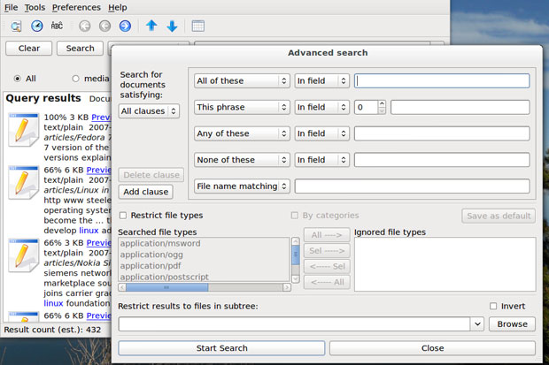
Performing an Advanced Search is just as simple. Start by clicking the first icon in the toolbar row. This allows defining more precise criteria. Enter choices in the various entry windows and select from the drop-down choices. These provide an extensive combination of fields, captions, extensions, keywords, recipient and author names.
You can further select a directory from the Browse windows. Also, you can restrict file types and add them to the exceptions list from the "Restrict File Types" section at the bottom.

Bottom Line

Recoll is a powerful yet simple-to-use full-text desktop search tool that indexes the contents of many file formats. You can perform simple searches as well as advanced operations like searching for the author, file size, file format as well as operators like "AND" or "OR."
This search tool needs almost no setup and has nearly no learning curve. It gives superior results whether you are a skilled search pro or a search-challenged novice